Categories and navigation
Turn a pile of articles into a browsable, logical hierarchy.
Opening a help site that’s just one long alphabetical list of 200 articles feels like rummaging through a junk drawer. Everything’s technically in there, but good luck finding the one thing you actually need. That pile-of-articles feeling is exactly what a bit of structure is built to fix.
Knowledge base categories are the labeled groups that turn that pile into something people can browse without thinking hard. Get them right and a visitor lands, scans a short list of clearly named sections, and heads straight for the answer. This is one part of the bigger job of structuring a knowledge base, and it’s the part your customers feel most directly, because it’s the first thing they see.
Here’s how to go from a messy content dump to a browsable hierarchy: how many categories to use, how to group articles, how to order and name them, and which navigation patterns actually help.
What are knowledge base categories?
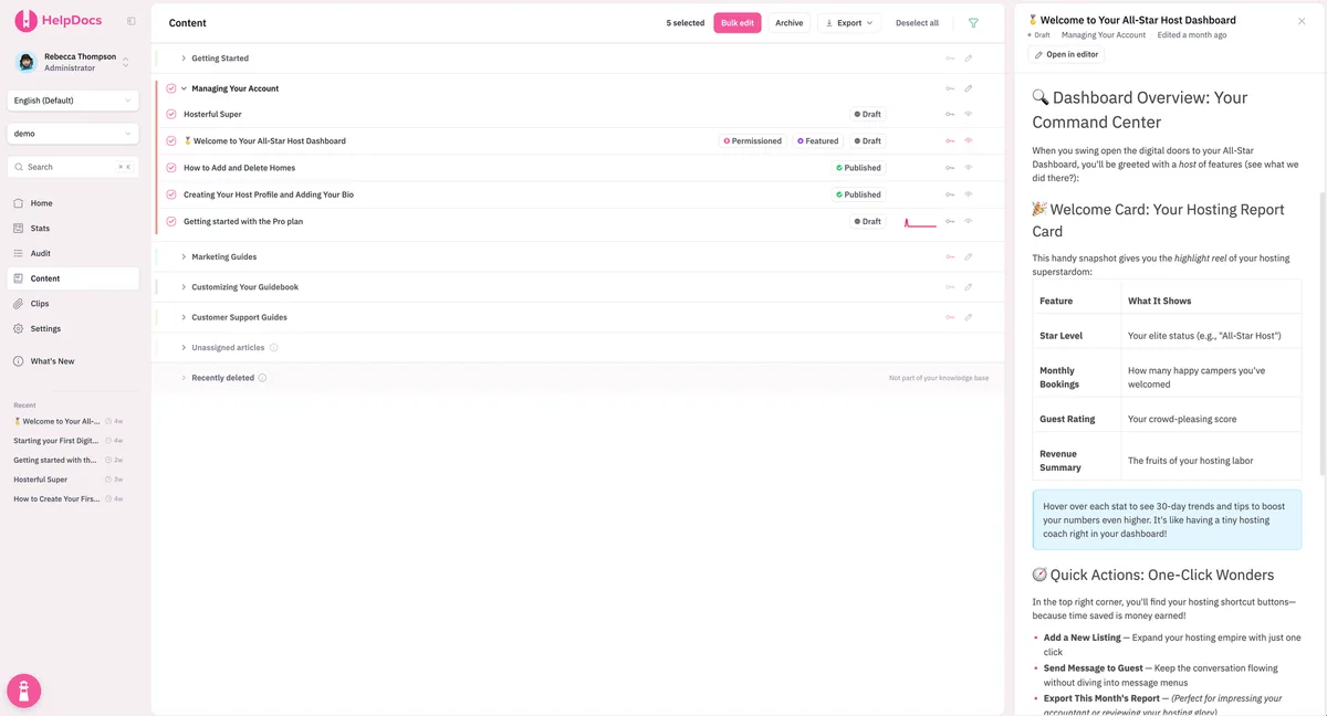
A category is a container that groups related articles under a single name, like “Billing and payments” or “Getting started.” Categories give your help center a shape. Instead of one flat list, you get a set of clearly labeled doors, each leading to a smaller, more focused set of articles.
Most knowledge bases use two or three levels: top-level categories, optional subcategories inside them, and the articles themselves. Your top-level categories carry the most weight, since they’re the map everyone reads first, and we cover choosing those in how to pick your top-level categories.
How many categories should a knowledge base have?
Fewer than you’d think. The goal is a top level someone can scan in a couple of seconds, which in practice means aiming for around five to eight top-level categories. Too few and each one becomes a bloated catch-all. Too many and you’ve just rebuilt the junk drawer with extra steps.
If you’re staring at 15 candidate categories, that’s a sign to consolidate. Groups that hold only one or two articles should usually be folded into a bigger, related section.
Depth matters less than people assume. The old “three-click rule,” the idea that any answer must be reachable within three clicks, has been thoroughly debunked: Nielsen Norman Group found that user satisfaction doesn’t drop off as click count rises, as long as people feel they’re on the right path. So don’t flatten everything to hit an arbitrary click target. Clear labels beat shallow menus every time.
How to group articles into categories
Here’s where most people stall. You’ve got the articles, but which ones belong together? There are a few common grouping logics, and the best knowledge bases usually blend two of them rather than forcing everything into one.
| Grouping logic | Groups articles by | Works best when |
|---|---|---|
| By topic | Subject matter (Billing, Security, Integrations) | Your product has distinct feature areas |
| By task | What the user is trying to do (Setting up, Troubleshooting) | People arrive with a clear goal in mind |
| By audience | Who’s reading (Admins, End users, Developers) | Different roles need very different answers |
| By journey stage | Where they are (Getting started, Advanced) | Onboarding and mastery look very different |
Whichever logic you lead with, group around how customers think, not how your company is organized internally. A customer doesn’t care which department wrote the article. They care about the thing they’re trying to do, and that customer-first grouping is the heart of good knowledge base information architecture.
How to order and label your categories
Order and wording do a surprising amount of quiet work. Two categories with identical contents can perform very differently depending on how they’re named and sequenced.
For ordering, resist the urge to go alphabetical. It’s easy for you and useless for readers, because it scatters related sections and buries the popular stuff. Instead, lead with what most people need first. A sensible default runs roughly:
- Getting started (everyone passes through here)
- Core features (the day-to-day how-tos)
- Billing and account (high-traffic, always asked about)
- Troubleshooting (for when something breaks)
- Advanced and admin (the deeper, lower-traffic stuff)
For labels, be specific and plain. “Getting started” beats “Onboarding.” “Billing and payments” beats “Account management.” Skip internal jargon, product code names, and clever wording nobody would ever type into a search box. A good category label is one a customer could have written themselves.
Help center navigation patterns that actually work
Categories only pay off if people can move through them smoothly, so a few navigation staples are worth building in from the start.
- A visible category grid or menu on your help center home page, so the whole structure is scannable at a glance rather than hidden behind search.
- Breadcrumbs on every article, showing the path back up (Home > Billing > Refunds). Nielsen Norman Group notes that breadcrumbs give people one-click access to higher levels and orient anyone who parachutes in from a search engine or a deep link. They’re cheap to add and genuinely useful.
- Search that sits front and center, because a lot of visitors will skip your careful hierarchy entirely and just type. Categories are for browsers, search is for people who already know what they want, and you need both.
- “Related articles” links at the foot of each article, nudging people toward the next logical step without forcing them back to the top.
The bottom line
Turning a pile of articles into a browsable knowledge base comes down to a handful of decisions: keep your top level to a scannable five-to-eight categories, group them around how customers think, order them by what people need most, and label them in plain language. Then wire it together with a visible menu, breadcrumbs, search, and related links.
Do that and your help center stops feeling like a junk drawer and starts feeling like a well-organized library. For the fuller blueprint, our guide to structuring a knowledge base ties categories, information architecture, and search into one plan, and the HelpDocs blog has a hands-on take on what makes a knowledge base work.