Information architecture for help centers
Group articles so people find answers in a click or two, not five.
You know the feeling. You need to change one setting, you open a company’s help center, and suddenly you’re four menus deep, backtracking, opening things in new tabs, and quietly losing patience. The answer is probably in there somewhere. You just can’t reach it.
That gap between “the article exists” and “a person can actually find it” is the whole job of knowledge base information architecture. Knowledge base information architecture (often shortened to IA, and sometimes called help center information architecture) is how you organize, group, and label your articles so people land on the right one in a click or two. It’s the invisible scaffolding underneath your categories, your navigation, and your search. Get it right and customers barely notice it. Get it wrong and even brilliant articles go unread.
If you’re setting your library up from scratch, pair this with our walkthrough on how to structure a knowledge base, which covers the build step by step. Here we’re focused on the thinking behind it: how to group and label things so answers surface quickly.
What is knowledge base information architecture?
At its core, IA is three decisions working together. First, hierarchy: how your content nests, from broad categories down to individual articles. Second, labeling: what you actually call those categories and articles. Third, navigation and search: how people move through the structure once they arrive.
None of these live in isolation. A perfect hierarchy with confusing labels still leaves people stranded, and great labels buried five levels deep still take too long to reach. Good IA is the point where all three agree with each other, and with how your customers actually think.
Why findability beats a tidy structure
It’s tempting to judge IA by how neat the menu looks. The better measure is findability: can a real person get to the right answer quickly, whether they browse or search?
The appetite is clearly there. Zendesk found that 91% of customers say they’d happily use a knowledge base if it met their needs (Zendesk). “If it met their needs” is doing a lot of work in that sentence, though. Content people can’t find doesn’t meet anyone’s needs, no matter how well it’s written.
Findability has two lanes, and you need both. Some people browse, scanning categories until something looks right. Others ignore your structure entirely and go straight to the search bar. Strong IA serves both: clear categories for the browsers, and consistent labels and tags that make search return the right result.
How deep should your knowledge base hierarchy go?
This is where a stubborn myth shows up: the “three-click rule,” which claims users give up if an answer takes more than three clicks. It sounds sensible, and it’s wrong. When Joshua Porter tested it with 44 users across 620 tasks, he found no drop-off in success or satisfaction after the third click (Center Centre / UIE). People happily clicked well past three, as long as each click felt like progress.
The lesson isn’t “clicks don’t matter.” It’s that clarity matters more than click count. Users don’t quit at click three. They quit when they feel lost, when a category name is vague, or when nothing on the page confirms they’re heading the right way.
For most knowledge bases, that points to a shallow, wide structure over a deep, narrow one. Two or three levels is plenty:
| Level | What it holds | Example |
|---|---|---|
| Category | A broad area of your product or service | “Billing and plans” |
| Subcategory (optional) | A grouping within a busy category | “Invoices and receipts” |
| Article | One specific, self-contained answer | “How to download a past invoice” |
Reach for that optional middle layer only when a category genuinely has too many articles to scan at a glance. Adding subcategories nobody needs just buries answers deeper for no reason.
Match your categories to how customers think
Here’s the principle that fixes most bad IA: organize around the customer’s mental model, not your internal one. A mental model is the rough map someone already carries in their head of how things should be grouped. When your structure matches that map, finding things feels effortless. When it clashes, every click is a small argument.
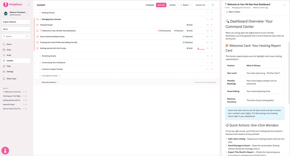
In practice, that usually means grouping by the customer’s task or goal (“Get started,” “Manage your account,” “Fix a problem”) rather than by your feature names or the team that owns each area. Your customers don’t know which squad shipped which button, and they shouldn’t have to. The words on your categories matter just as much, which is why it pays to get your category structure right early and to think deliberately about your knowledge base taxonomy, the naming and tagging system that keeps everything consistent as you grow.
Plain, boring labels win here. “Shipping and returns” beats a clever branded name every time, because people search and scan for the words they already use, not the ones you wish they’d use.
How to test findability with card sorting
You don’t have to guess at your customers’ mental model. You can measure it, and the classic tool is a card sort. You write each topic on a card (physical or digital) and ask real users to group the cards into piles that make sense to them, then name each pile. The patterns that emerge become your categories.
There are two flavors. An open card sort lets people create and name their own groups, which is perfect early on when you’re discovering structure. A closed card sort gives them your existing categories and asks where each article belongs, ideal for validating a structure you already have. A related method, tree testing, checks the reverse: give people your finished menu, ask them to find specific answers, and watch exactly where they take a wrong turn.
How many people do you need? Not as many as you’d think. Nielsen Norman Group found that testing 15 users gets you a 0.90 correlation with the “true” grouping, with sharply diminishing returns after that (Nielsen Norman Group). That’s a very affordable amount of research for a decision this foundational.
The bottom line
Knowledge base information architecture is the difference between a library people love and a maze they abandon. Keep the hierarchy shallow, label things in your customers’ own words, and organize around their goals rather than your org chart. Then test it with a quick card sort instead of trusting your gut.
Do that, and the payoff is simple: answers show up in a click or two, tickets that never needed a human quietly disappear, and the articles your team worked hard on actually get read. Ready to put it into practice? You can start building your knowledge base and shape the structure as you grow.